(Click to see full image)
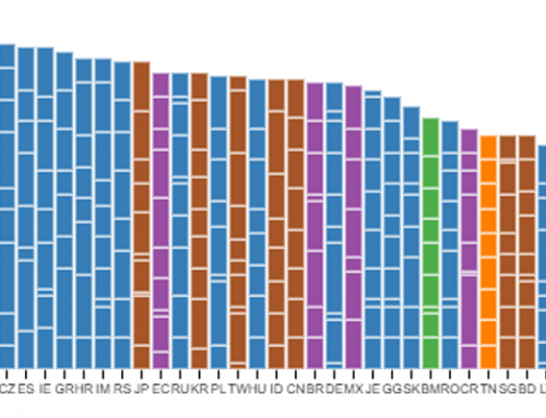
This map depicts the locations of the world’s top 400 universities as ranked by the Times Higher Education. It also illustrates the relative wealth of the country that hosts each university.
Data
The map uses data from the World University Rankings 2013-2014, published by the Times Higher Education, in collaboration with Thomson Reuters. Thirteen indicators that measure teaching, research, knowledge transfer and international outlook are taken into account in order to evaluate universities.
Each university is represented as a square, and shaded according to the World Bank income group that its country belongs to. The four World Bank income groups are high-income (GNI per capita of >$12,616), upper-middle income ($4,086 – $12,615), lower-middle income ($1,036 – $4,085), and low-income (<$1,036). We exclude the low-income category from this map because not one of the 400 universities is located in a low-income country.
The universities are grouped by world region, and the equator is depicted as a red line towards the bottom of the map.
Some universities are further grouped into metropolitan region clusters. The clusters have been identified using the DBSCAN density-based clustering algorithm, applying a 50 km distance threshold, and a minimum cardinality of four universities. Because of the compact nature of many European cities, we further refined some clusters manually in order to achieve meaningful definitions of metropolitan regions.
Findings
The primary finding is that most of the world’s top-ranked universities are located in the world’s wealthiest countries (a point also made by Benjamin Hennig and his cartograms of the Times Higher Education rankings). The Greater London cluster alone, which does not include Oxford and Cambridge, contains the same number of top-400 universities as all of Sub-Saharan Africa, the Middle East, and Latin America combined!
Not only are there are no low-income countries represented in the ranking, but India is also the only lower-middle income country represented, being home to five of the top-400 ranked universities. Latin America and Sub-Saharan Africa are home to three universities each, all six being based in upper-middle-income countries (i.e., Brazil, Colombia, and South Africa). These eleven elite universities in India, Latin America, and Sub-Saharan Africa serve a population of over 2.7 billion people.
The ranking also includes ten universities in China, an upper-middle-income economy that is home to over 1.3 billion citizens, and seven other universities from the same income group: five in Turkey, one in Iran, and one in Thailand. The remaining 34 Asian universities included in the ranking are mostly concentrated in densely populated (and wealthy) cities like Hong Kong, Seoul, Taipei, Tokyo, and Singapore.
The Middle East and North Africa also reveals a relatively concentrated geography of elite universities. Of the six universities included from the region, three are in Israel, two in Saudi Arabia, and one in Iran.
Oceania is interestingly the largest world region (in terms of number of top universities) present below the equator. All the top-400 universities in this region are found either in Australia or New Zealand, with two large clusters in Melbourne and Sydney.
Almost half of the top-400 universities are located in Europe, and over a quarter are in the United States. Northern Europe and the US East Coast are home to some of the largest university clusters, most notably in Greater London and Boston.
It’s important to remember that there are tens of thousands of universities that aren’t represented on this map; what this graphic doesn’t do is visualize the potentials or practices of all higher education worldwide. However, what it does do is clearly illustrate the highly uneven geography of elite education. The universities in the top-400 list don’t just command an undue amount of power, resources, and influence, but also serve to actively produce and reproduce it in particular parts of the world.
