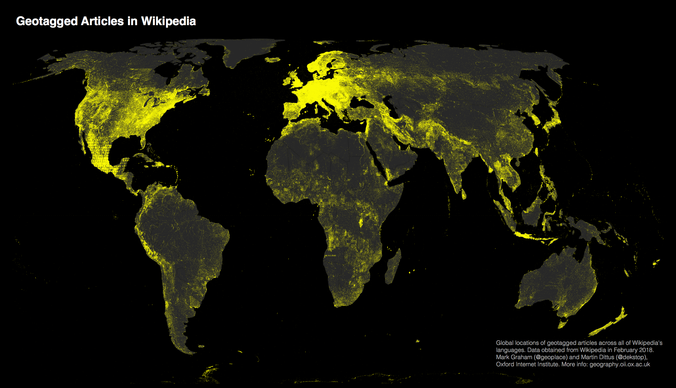
(Click to see full image)
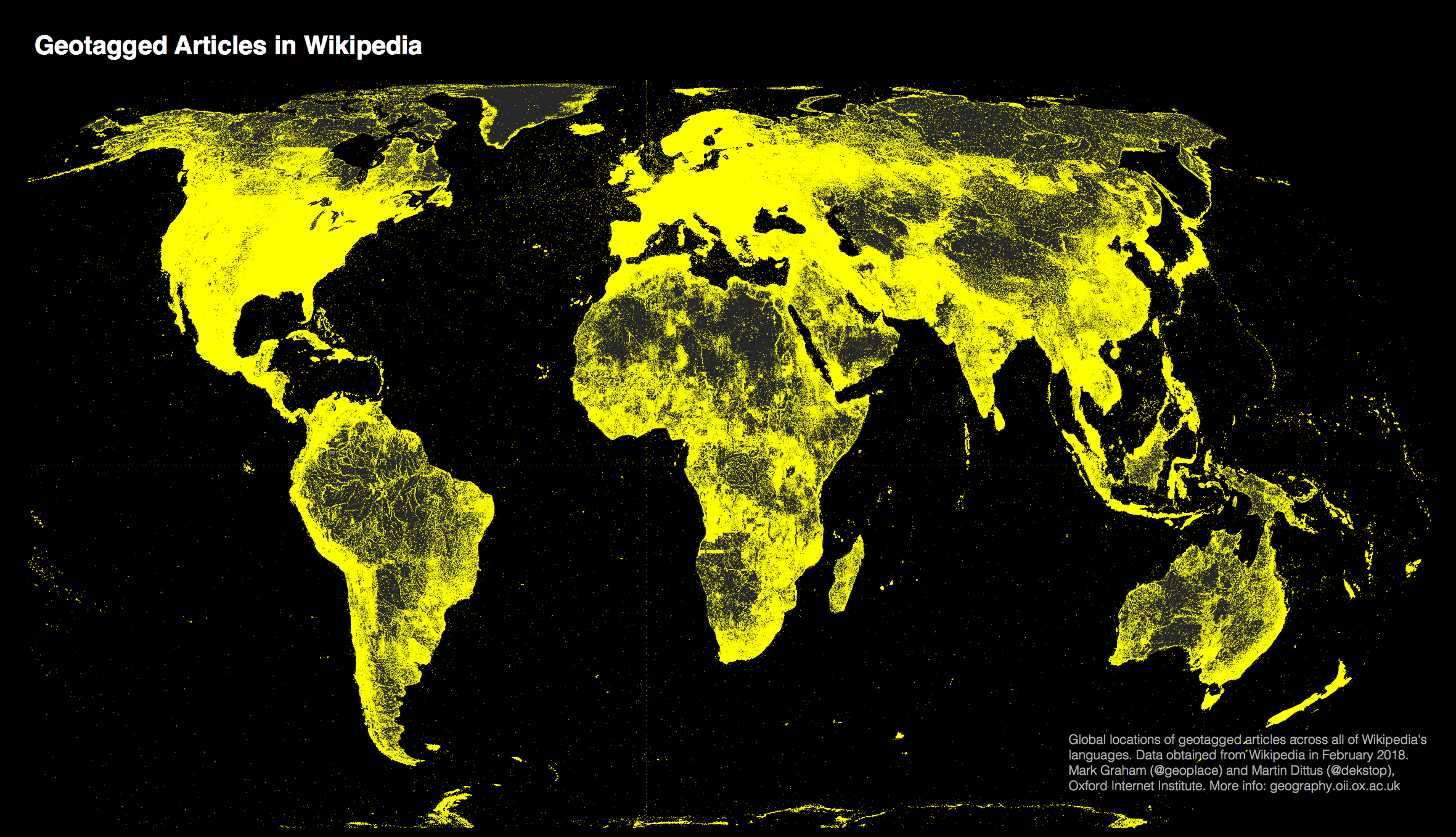
We produced the first map of the content geography of English Wikipedia back in 2013. We are now sharing an updated version that covers all of Wikipedia’s 300 languages.
Data
Using data from early 2018 we identified more than 7 million geotags in Wikipedia articles across Wikipedia’s 300 languages. Not all Wikipedia articles are geotagged, but almost all articles about events and places tend to be. This includes references to the birthplaces of notable people, and other places relating to historic or current events.
Findings
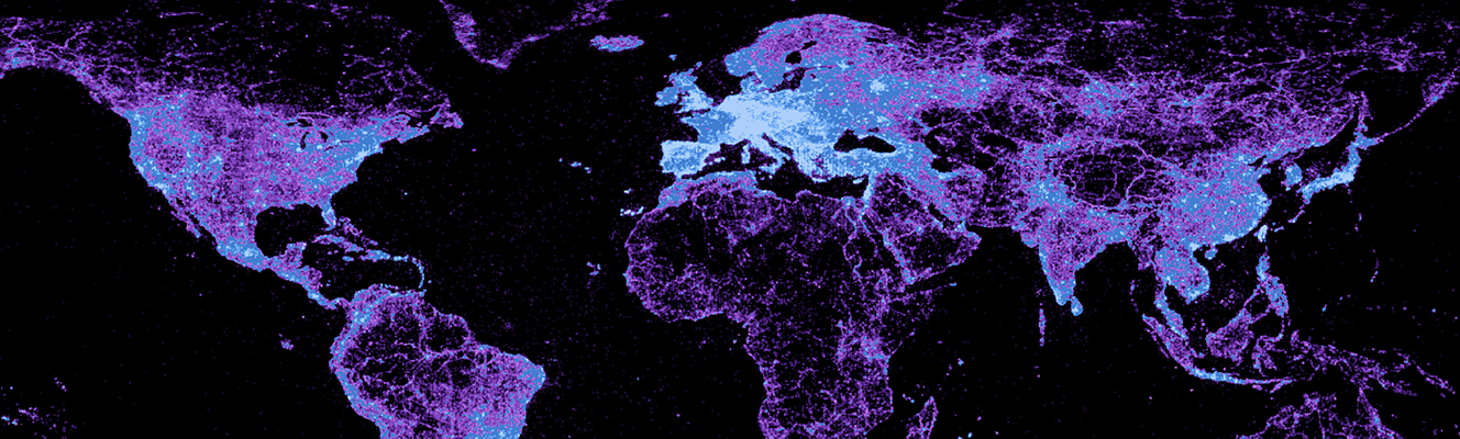
Compared to our last survey we can see an encouraging trend. On one hand, Wikipedia’s global content distribution is still highly unequal: Central and Western Europe and North America are still bright hotspots of dense information, while most other regions of the world are comparatively sparse. However, compared to our initial survey we can see significant improvements in global coverage. With a tenfold increase in geotagged locations many more parts of the world are now visible on the map. This is in part due to the inclusion of more languages in our survey. However it is also the effect of real growth in global coverage, no doubt in large part due to Wikipedia’s significant efforts to increase global coverage.
About the map
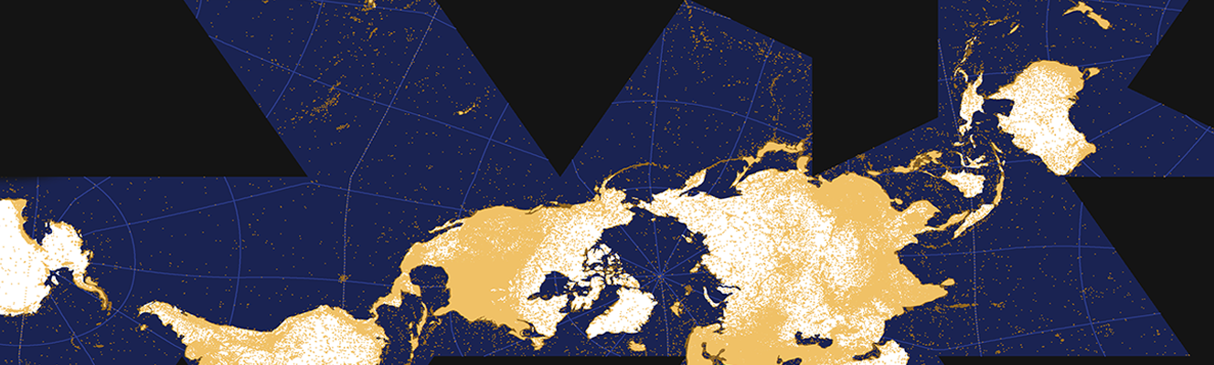
Cartography buffs may have noticed that we use the relatively new Equal Earth projection, an equal-area projection that shows continents and countries at their “true” sizes relative to each other.
We further had to adapt our visualisation style to accommodate an increase in data volume. While our previous map of Wikipedia “only” had to visualise 700,000 data points, the data set for this updated map is an order of magnitude larger. Where previously we drew each geotag as a full pixel, we now draw each geotag as only a fraction of a pixel. This ensures that we can still see spatial structure in comparatively content-dense regions, however it also means that regions with only few geotagged articles won’t appear quite as bright as before.
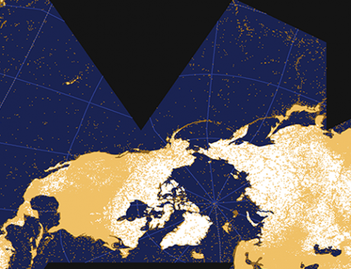
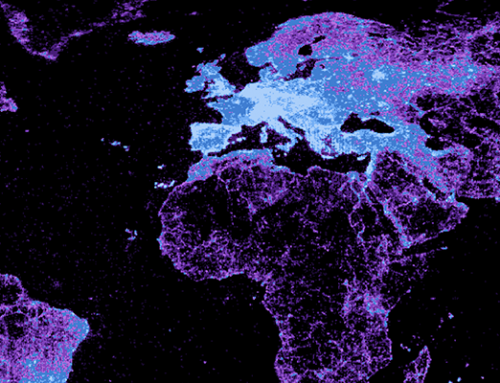
If we were to use the original visualisation style, the entire map would be significantly brighter: