(Click to see full image)
This series of maps shows the location of edited content in the world’s largest collaborative mapping project: OpenStreetMap.
Data
The maps use OpenStreetMap data downloaded from GeoFabrik.de on December 12th, 2013. Each sub-region extract has been parsed and for each node (i.e., elements used in OpenStreetMap to represent any point feature), the coordinates, version, and last update values have been selected.
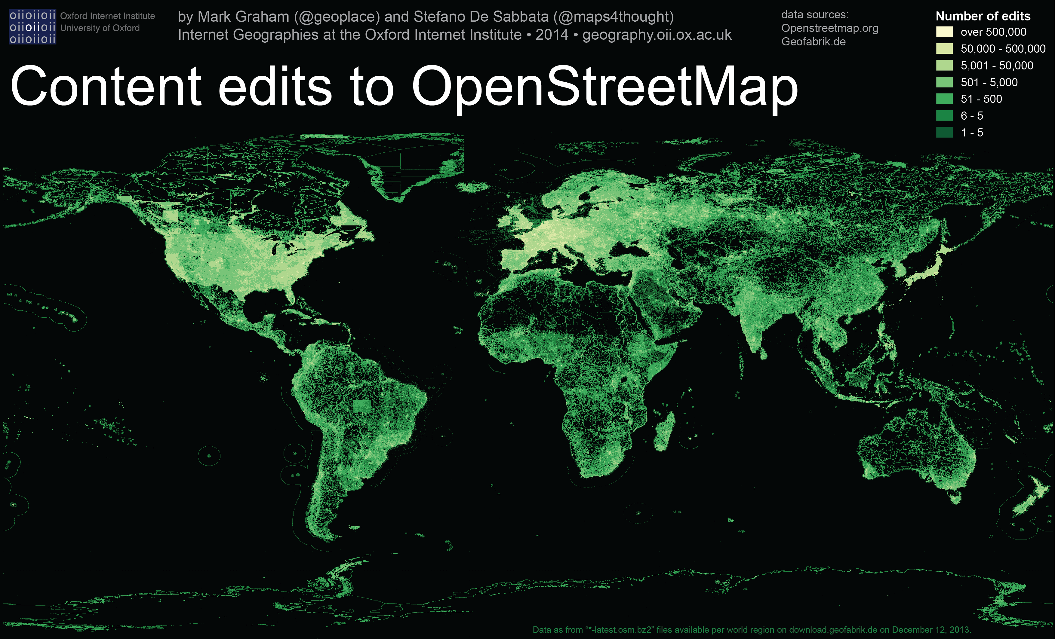
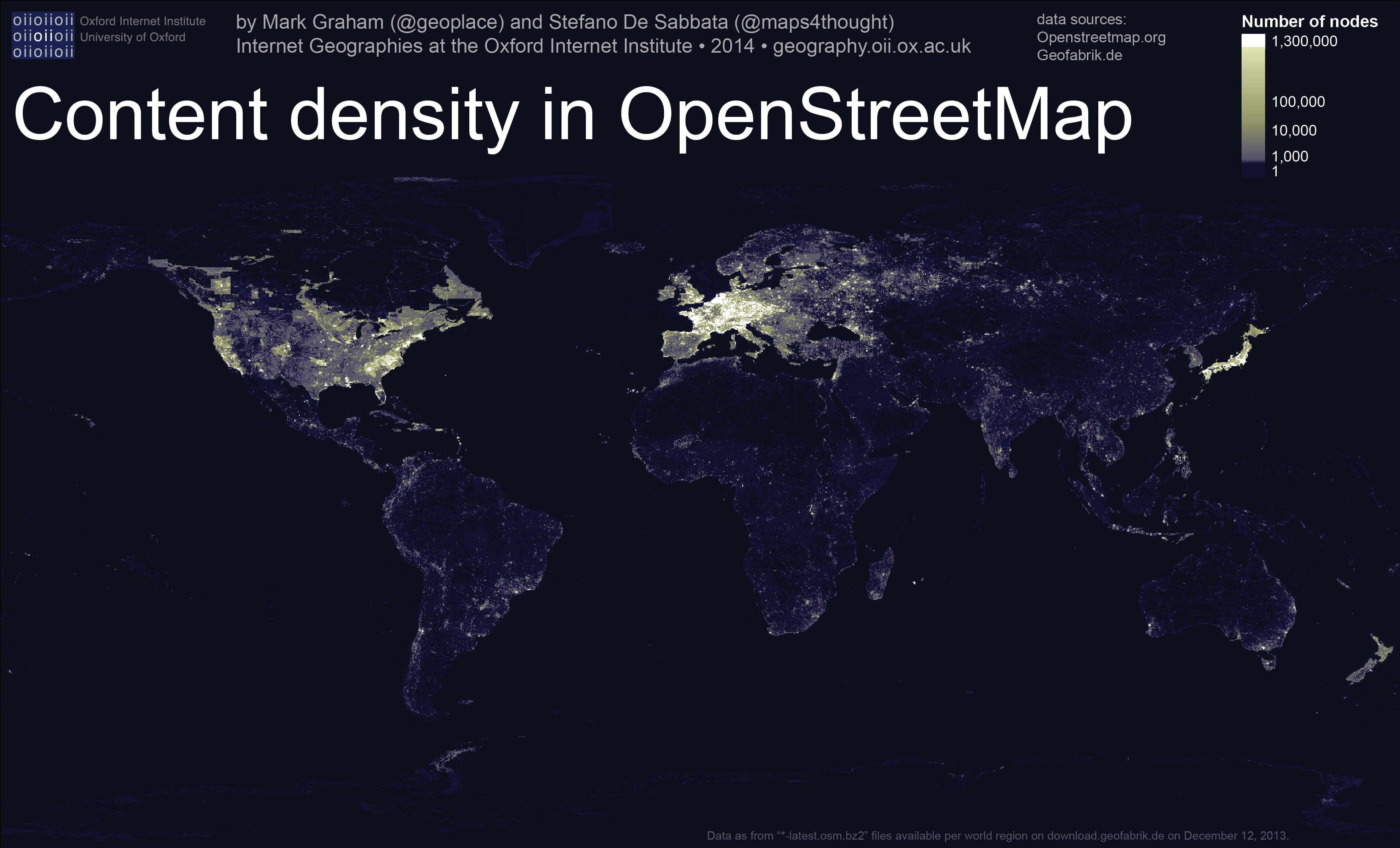
The first map was created by counting the number of nodes for each cell in a grid of 0.1 degrees of latitude per 0.1 degrees of longitude. The second map instead focuses on edits by summing the version numbers of all nodes in a cell (as this number is increased by one each time a node is modified), resulting in a count of all edits for the whole history of OpenStreetMap. The third map focuses on the age of content, and so records the latest update made to a node for each cell of the grid.
Findings
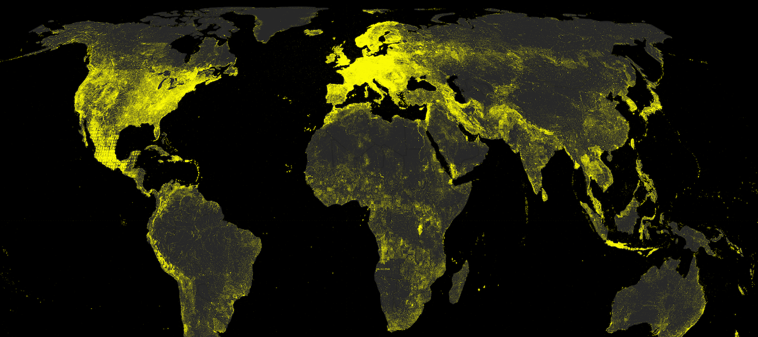
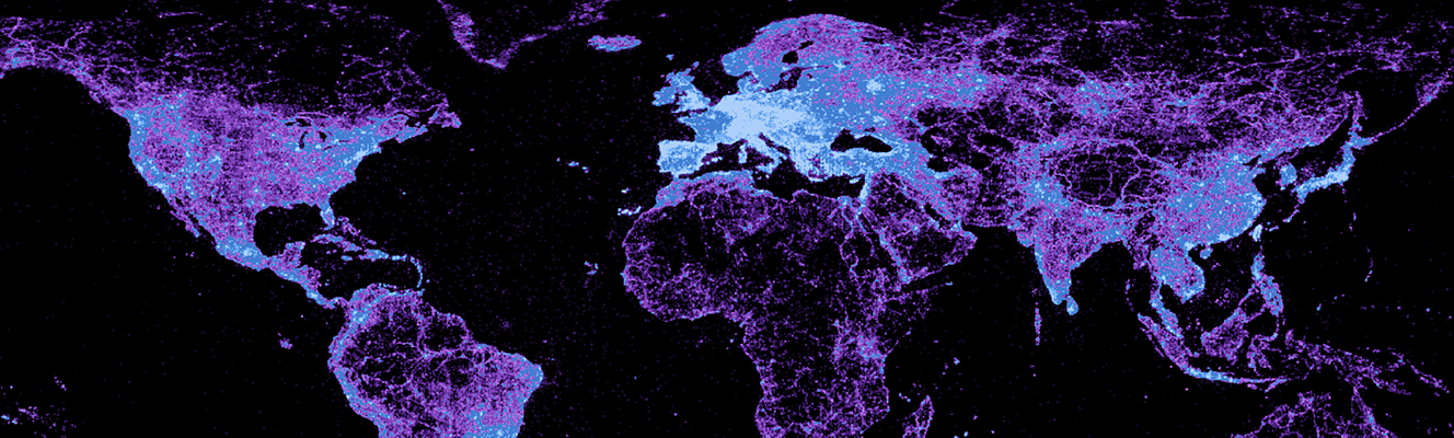
The first map offers a revealing picture of the presence of thick layers of content that annotate a few parts of the world, and a relative absence of content over much of the rest of the planet. The glowing centres of content in parts of North America, Europe, Oceania, and Japan, in many ways, parallels the visual intensity of lights in NASA’s Earth City Lights series.
The United States account for the largest total amount of content, collecting 21% of all nodes present in OpenStreetmap (OSM), followed by France, Canada, Germany and Russia, all counting more than 100 million nodes. These five countries alone collect 58% of the content, and high-income OEDC countries sum up to about 80% of OSM.
The Netherlands enjoy the highest density of content, with an average of over 1000 nodes per square kilometre, followed by Belgium with over 700 nodes per square kilometre, and Germany, the Czech Republic, Switzerland, and France, with about 400 nodes per square kilometre.
In contrast to the brightness of the Europe, the southern hemisphere is barely visible, as the amount of content available on OSM about that part of the world is far lower than in the northern hemisphere, with Africa and Latin America represented by less than 5% of the content. California alone accounts for almost as much content as the entirety of Africa.
Turkey and the western part of the Middle East are visible, but already fading into a less intense color. The emerging powers of Brazil, India, and China appear to be suffering from wide-spread content “blackout”, where only the largest urban centres are visible. Brazil accounts for fewer nodes than Switzerland, and China for even fewer. The same applies to most of the remaining parts of Africa, Asia, and Latin America. One of the oldest urbanized areas of the world, an amazing strip of lights that follows the course of the Nile, is barely visible. In fact, Egypt accounts for as many nodes as Iceland, despite being 10 times as big and accounting for 250 times the population.
Interestingly, content in parts of North Korea lights up the map: an unusual situation for a country not renowned for even appearing in most indices of online participation. This is most likely thanks to work done in 2011 by the OSM developers community. We see a similar situation in Newfoundland and Labrador: with large swaths of sparsely populated land characterised by relatively dense amounts of content. The Canadian case is likely a result of a detailed physical geography dataset that was bulk-uploaded to OpenStreetMap.
Several studies have been conducted on the quality of OSM’s coverage in these areas (e.g., see the paper by Haklay et al, 2010) where high-quality data from government agencies are also available for comparison. However, it has to be noted that these are the same countries where Open Data policies have spread, allowing lots of data to be uploaded to OSM. In fact, the visible distribution of content is not too different from the map of the GeoNames gazetteer project we published some months ago.
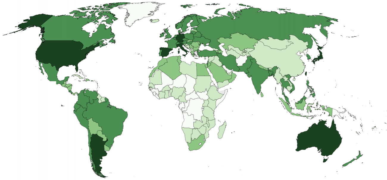
The second map below illustrates the number of edits made to OpenStreetMap. Unsurprisingly, the most content-dense areas are also the most heavily edited, because each new node included means one more edit made within the related area. However, statistical analysis suggests that the United States and Germany account for far more edits than would be expected given the related content in OSM, whereas content from Italy and Netherlands is far less edited than expected. In most parts of the rest of the world the number of edits is simply related to the number of objects in a given area.
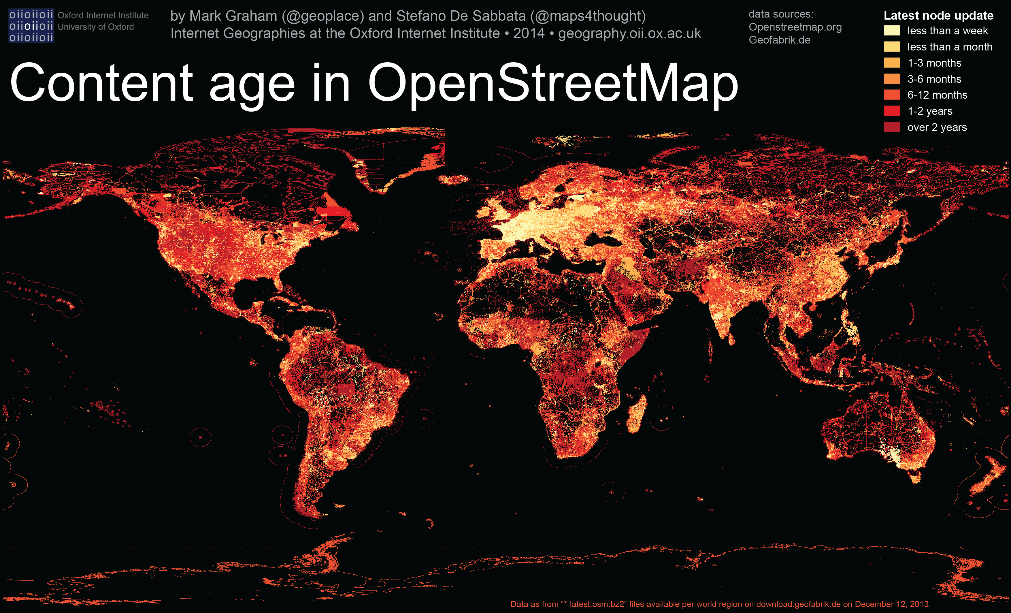
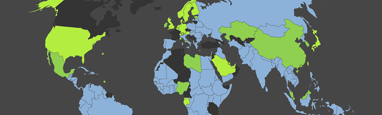
The third and last map presents an illustration of the most and least recently updated areas in OSM, similarly to a map included in the recent Mapbox’s 2013 OpenStreetMap Data Report.
It is not surprising that most areas in Europe have seen at least one edit in the week before the data were collected. Similarly, it is evident how the most remote regions of the world have not been updated for years, from Siberia to the Australian Outback, from central Africa to the Amazon basin and northern Canada.
While most of the map shows a random mix of data, due to the volunteer-based nature of the projects, there are some evident areas of plain colour, which might indicate bulk uploading of new data and datasets from government agencies or companies. An examples can be found in Iraq, where most of the country has been updated between September and November 2013; in Australia, where large areas in South Australia have been recently updated, and the updates clearly follow the state borders with New South Wales and Victoria states; and in Estonia, which has also received recent edits for most of its territory.
OSM will turn 10 years old in a few months, and combining the findings obtained from these three maps, it is evident how it is a very good geographical representation of the most developed countries, and their urban environment. OSM also provide large amount of information about non-rural areas, although these are not as up-to-date and detailed as urban areas.
The quantity and the quality of the data make OSM one of the most powerful and exciting open-source projects that the Internet has facilitated in recent years, along with Linux and Wikipedia. Nonetheless, there is still a lot of work to do, and the development of the project in its second decade will probably depend on it attracting new volunteers among the new Internet users in Africa, Asia, Latin America, and the Middle East. Finally, OSM will be influenced by the relationships with those many companies which are currently based their mapping services on it, as well as the future spread of open data policies.