(Click to see full image)
Online social media has become an integral part of daily life for many Internet users and there are now hundreds of millions utilising these services around the world. Concomitant with this growth of usage is a desire by companies, government agencies, and academics to study and map the data trails left by people using services like Twitter, Flickr, and Facebook. The data shadows and information trails left by users online reveal social, economic, and political processes and practices.
Twitter, in particular, is repeatedly used as a repository of social data because of its relatively open network that allows researchers access to almost any information published through the platform. Yet, despite the many studies (both inside and outside of academia) that draw on data from Twitter, there is little scholarship devoted to the geography of Twitter.
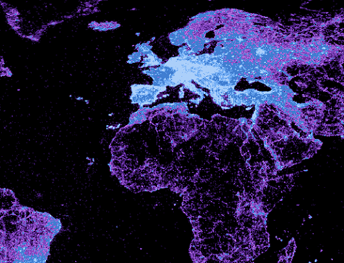
As a first step, we decided to collect all georeferenced tweets sent between March 5 and March 13, 2012. It is important to point out that georeferenced tweets comprise fewer than 1% of all tweets and it is possible that significant geographic biases exist in where and how people georeference their content [1]. We then took a random 20% sample of that dataset: giving us approximately 4.5 million tweets that we spatially joined at the country-level.
Our graphic illustrates these data as a spatially aware treemap. The size of each block represents the number of tweets emanating from that country and the shading reveals in the number of geocoded tweets as a proportion of that country’s Internet population (i.e. it gives us a sense of how likely Internet users are to create geocoded Twitter content).
The graphic reveals a large amount of inequality in the geography of content. However, while many other online platforms and more offline knowledge sources are characterised by distinct digital divisions of labour in which the Global North is a predominant producer and subject of content [2], Twitter displays significantly different geographies.
The six largest countries in terms of information production through Twitter are: (1) the United States, (2) Brazil, (3) Indonesia, (4) the United Kingdom, (5) Mexico, and (6) Malaysia. It is interesting to note that only two of the countries on that list are in the Global North and are traditional hubs of the production of codified knowledge.
By mapping the distribution of tweets in the world it becomes apparent that Twitter is allowing for broader participation than is possible in most other platforms and media. In other words, it might be allowing for a ‘democratisation’ of information production and sharing because of its low barriers to entry and adaptability to mobile devices. Similarly barriers to the dissemination of information, such as censorship, are also visible through the small proportion of tweets originating in China (home to the largest population of internet users in the world).
However, more research is undoubtedly necessary to better understand the geography of content on the platform. Our sample in this post is limited, and even more important only allows us to visualise the quantity of georeferenced tweets that pass through the platform.
As virtual layers and augmentations of place increasingly matter to everyday life [3], it will become more important to understand the geographies of information. This map offers a starting point.
Acknowledgements: We wish to thank Devin Gaffney for his extensive work collecting the data for this analysis. This work has also been made possible by a grant from the John Fell Fund.
