(Click to see full image)
Wikipedia is by far the world’s biggest and most used encyclopedia, and 1600 times larger than Encyclopedia Britannica. 15% of all Internet users access it on any given day. It exists in 282 languages; 40 of those language versions have over 100,000 articles, and the English one alone contains close to four million. Mapping Wikipedia allows us to see the parts of the world.
Data
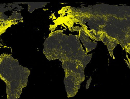
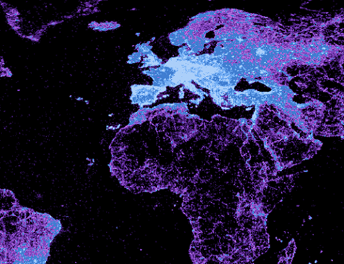
Each point on the map indicates one article in the English version of Wikipedia article that has been geotagged. The data are then shaded according to how many words each of those articles contains. The data in this map were all taken from November 2011 Wikipedia data dumps. Our project team wrote a script to search for coordinate representations in every article (taking into the varying ways in which geo-coordinates are expressed). We improved the quality of our coordinates by doing things like eliminating or fixing erroneous coordinates, grabbing coordinates (where sensible) from not just structured infoboxes, and making sure to remove irrelevant coordinates (Wikipedia actually contains a lot of coordinates for extra-terrestrial entities like lunar craters!).
Findings
This map displays some fascinating patterns that aren’t readily apparent when just looking at the raw counts of articles. North America and Europe really stand out as glowing clusters of information. Interestingly, articles in North America tend to be longer than European ones. Even within Europe, we see a significant amount of regional variation. For instance, many Italian and British articles are noticeably longer than articles in France or Poland. The contrast between the Japanese and Philippine archipelagos is also worthy of note. Although there are many more articles about Japan, those articles tend to be much shorter than articles in the Phillippines (Japanese articles also tend to be clustered around major transportation corridors). Ultimately, article length is only one of many possible measure of the quality of content in Wikipedia. But visualizing the volume of content created about hundreds of thousands of places in the world’s largest encyclopedia nonetheless goes a long way to shedding light on how people are digitally augmenting our planet.
