(Click to see full image)
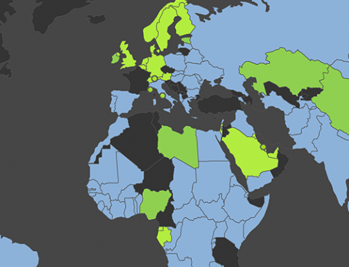
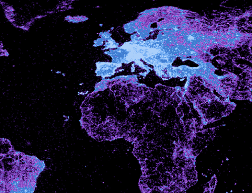
To make this map, we took quarterly data about the total number of edits (to all Wikipedia versions) to emerge from any territory (i.e. the amount of content that people are producing in each country) and averaged it over a two year period (2010-2011).
The map shows us that there are far more edits originating in Egypt than anywhere else on the continent. South Africa is then a distant second. The grey patches in Africa indicate countries that didn’t even register enough edits to show up in the Wikimedia Foundation’s sampling of edits.
The number of Internet users in a country explains some of the patterns that we see here, but can’t in any way explain all of the variance in the map (for instance, take a look at Nigeria: a country with over 45 million Internet users).
We are currently working on a paper that more closely examines these inequalities in participation in East Africa and the Middle East and North Africa, but would welcome any comments on this map in the meantime.
