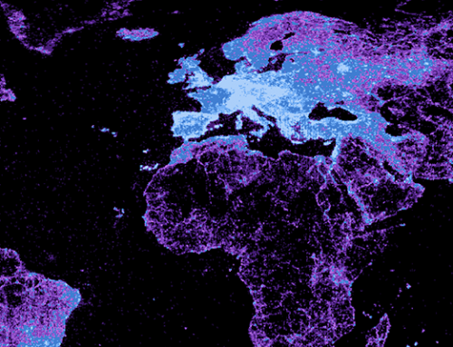
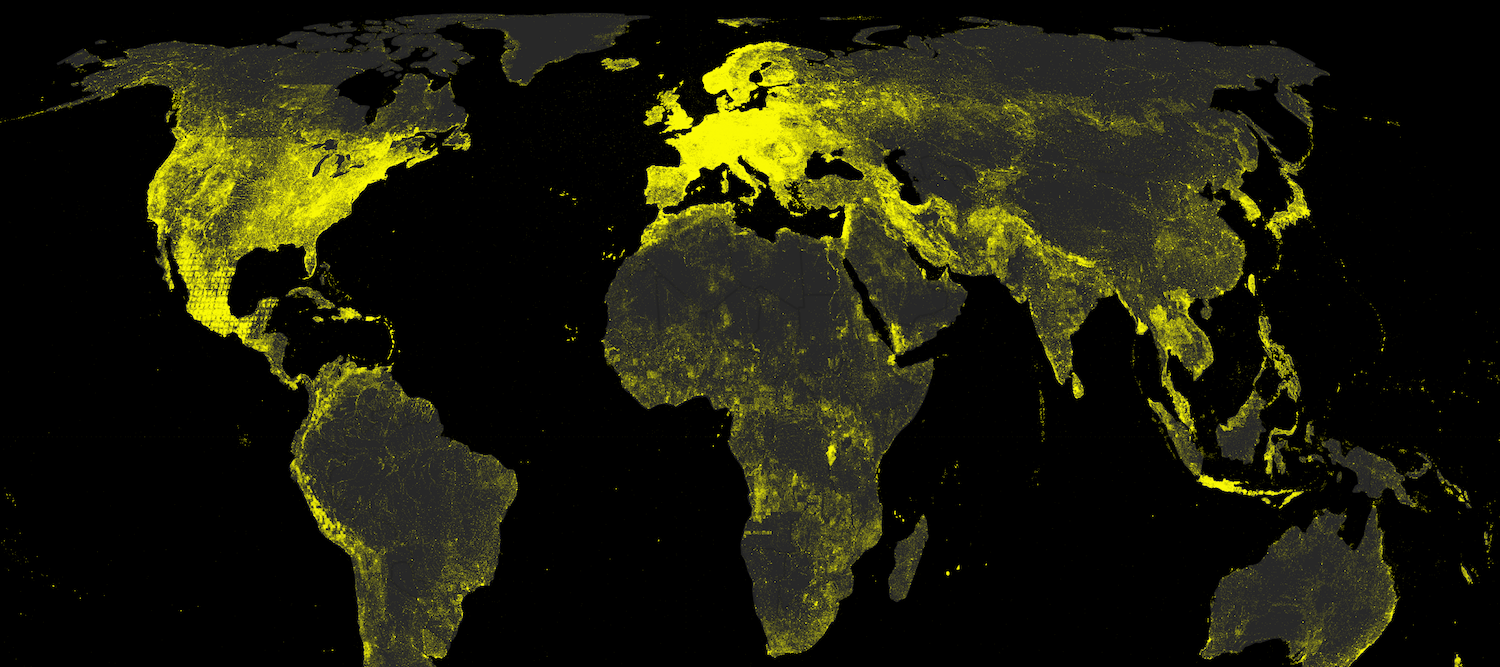
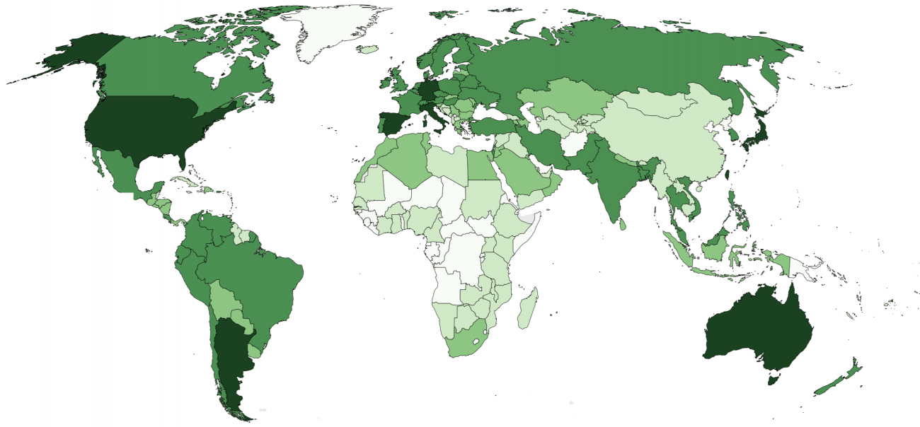
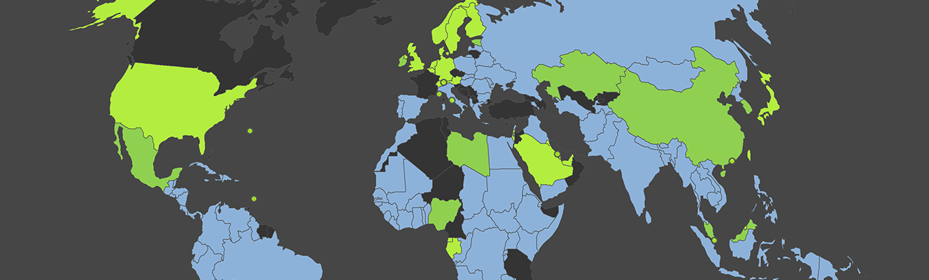
Mapping the GeoNames Gazetteer

//Mapping the GeoNames Gazetteer
Mapping the GeoNames Gazetteer
(Click to see full image)
Click to see full image

This visualization illustrates the density of place names listed in the GeoNames, the largest freely available gazetteer (i.e., a dictionary of geographic place names) covering the globe.

Data

This map uses GeoNames gazetteer data from May 2013. The pixel colours represent the number of placenames (i.e., names referring to a geographic place) per spatial unit: a square of a one tenth degree of latitude and one tenth degree of longitude.

GeoNames is both the world’s largest (and probably most used) gazetteer, and is based on freely available national gazetteers and datasets, as well as volunteered geographic information (VGI). This means that, in theory, anybody can enter data, suggest new place names, and edit existing content.

Findings

Most strikingly, the visualizations do not really resemble a map of population. Nor are the place names evenly distributed among regions and countries. Instead, we see dense clusters of place names in some parts of the world and a lack of geographic information in others. Interestingly, the information presences that we see are characterized by unusual patterns. Not only do we see the usual suspects of Western Europe and the United States with large amounts of geographic information, but we also see significant densities in places like Sri Lanka, Iran, and Nepal.

It is clear how national and international policies play a large role in the construction of this gazetteer. The United States is by far the most representative country in the dataset, accounting for a quarter of the total number of placenames. Nepal comes in 11th, apparently thanks to a project funded by the European Union in 2001, and counts more place names than India and the UK put together.

Iran counts almost the same number of placenames as Germany. North Korea is described in almost as much detail as Austria, and Sri Lanka counts even more placenames. However, while many German and Austrian government institutions can be found in the list of the main data sources, no such institutions from Iran, North Korea, or Sri Lanka are listed. This disparity is also probably not due to VGI content generated by users from those same regions, although information about the percentage of VGI content is not available on GeoName’s website.

It is likely that some of these patterns exist due to the fact that the National Geospatial-Intelligence Agency’s (NGA) and the United States Board on Geographic Names are the sources of many place names outside the United States and Canada. Created in 2003 as part of the U.S. intelligence, the strategy of the NGA is to provide “support to military and intelligence operations, intelligence analysis, homeland defense, and humanitarian and disaster relief”. These objectives might explain why we see a particular focus on places like Iran, North Korea, and Sri Lanka.

At the same time, we also see the role that crisis mappers have played in the dataset through the focus on places like Haiti, reflecting the intense effort that went into mapping the country after its 2010 earthquake. This indicates the database space in the gazetteer devoted in some places to describing locations of conflict and disasters.

It is worth noting that the same regions are covered in much less detail when taking into account only geographic information about cities and towns. If we do that, we see a much higher proportion of placenames in Europe, and a lower density in Africa and Asia. This is due to most of the placenames in the latter regions being assigned with populations equal to zero.

These spatial patterns in the gazetteer have important implications. For instance, gazetteers are frequently employed to geocode information from news or social network streams. A more detailed representation of areas afflicted by conflict or disasters may therefore result in these topics being found to be disproportionately prominent in datasets. Similarly, areas that are characterized by very few geographic representations are likely to become stuck in a vicious cycle of informational inequalities. By not appearing in the gazetteers themselves, they are unlikely to ever become present and visible in other geocoded datasets.

In sum, issues highlighted in previous work on gazetteers (such as Brunner et al. 2008), such as the fact that they paint selective geographic pictures, are seen again in our maps. These visualizations demonstrate that the process of opening up large platforms to crowdsourcing doesn’t seem to lessen inequalities in the geographies of information. Furthermore, because so much additional research (for example when geocoding unstructured text) relies on using large gazetteers, the biases that we see here are only likely to be propagated throughout the webs of knowledge.


References
Brunner T, Purves RS, and Weibel R. “Geographic Information Retrieval: Identifikation der geographischen Lage von Zeitungsartikeln’.” Master’s thesis, Geographisches Institut der Universität Zürich, Switzerland (2008).
By |2018-03-20T12:18:56+00:00June 20th, 2013|